I'm here — Vancouver, BC
Find what you need. Leave sooner.
Large grocery stores turn a quick shopping trip into a search through unfamiliar aisles. Grocery Nav connects a shopping list to an in-store map, helping shoppers locate each item without losing time.
Which layout helps shoppers find the next item?
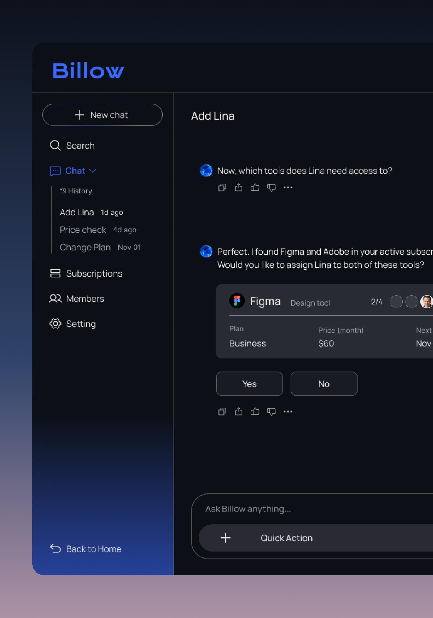
To learn which layout felt easier to use in a real aisle, I turned two competing ideas into testable prototypes. Version A kept the shopping list visible above the map. Version B used a collapsible bottom sheet to give the map more room. Shoppers used both while completing the same product-finding tasks.
Test sequence
Each participant tried both layouts.
P1
P2
P3
Fixed header
Keep the list in view
Products remain visible above the map, so switching items does not require opening another layer.
What worked
- +View the list and map together
- +Switch products in one tap
Trade-off
Collapsible bottom sheet
Give the map more room
The list can collapse to reveal more of the floor plan, then expand when the shopper needs another item.
What worked
- +Maximizes the map when collapsed
- +Places list controls near the thumb
Trade-off
What shoppers noticed in a real aisle.
I brought both layouts into a real grocery store and focused on how clearly shoppers could understand the next item and its location. The sessions were directional: I used what people noticed, missed, and asked for to choose the pattern.
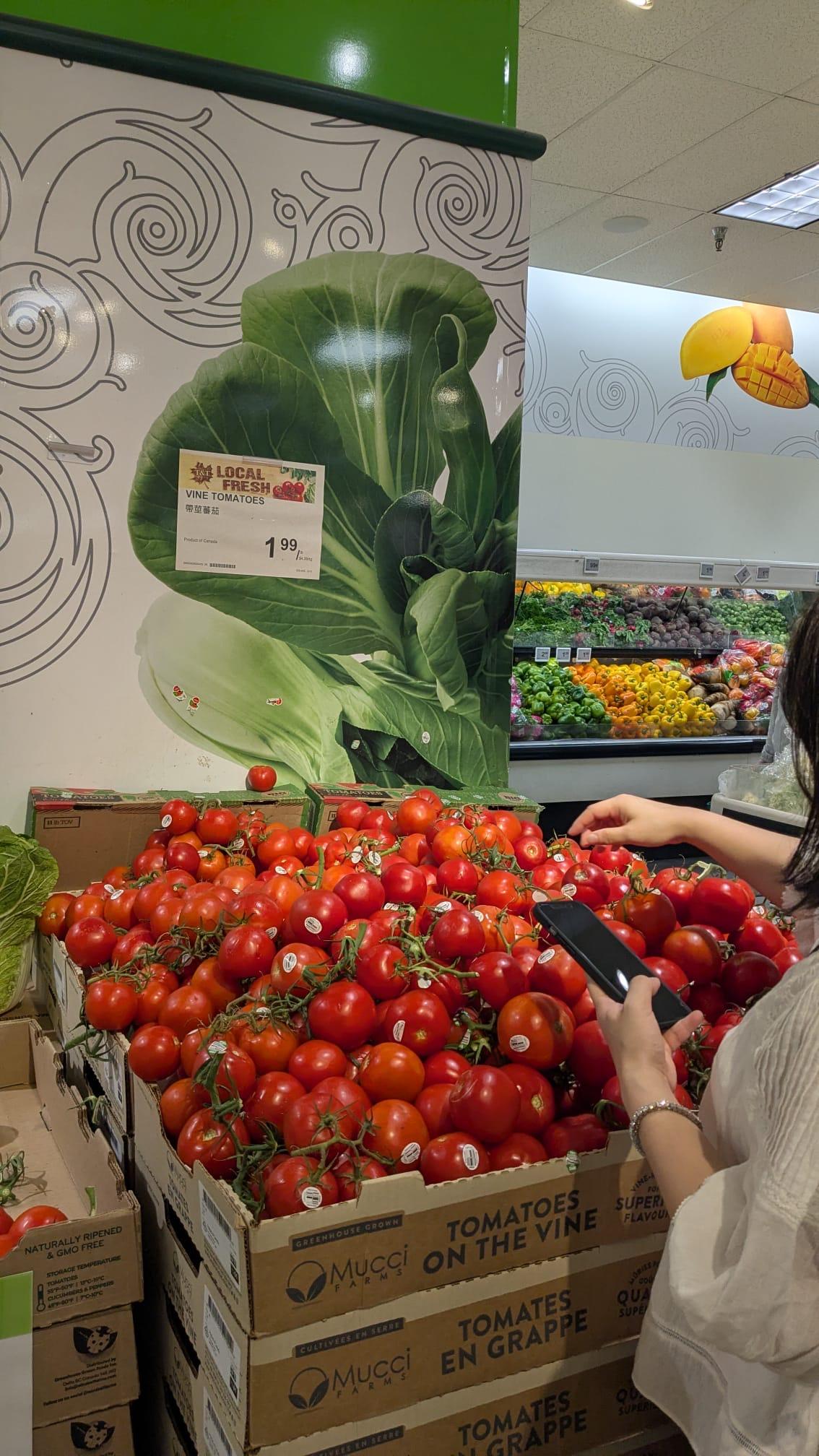
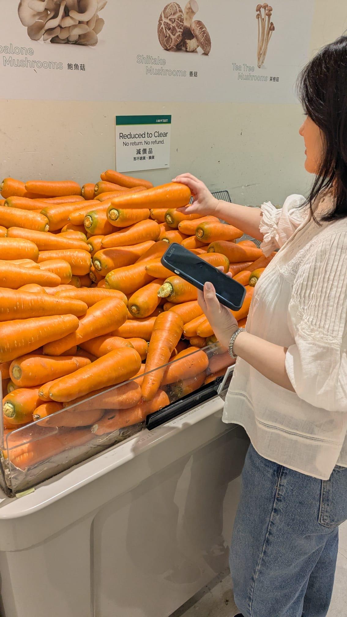
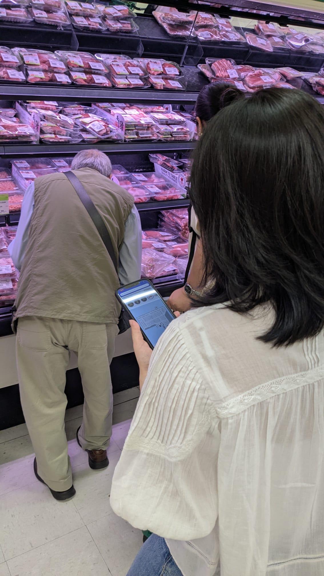
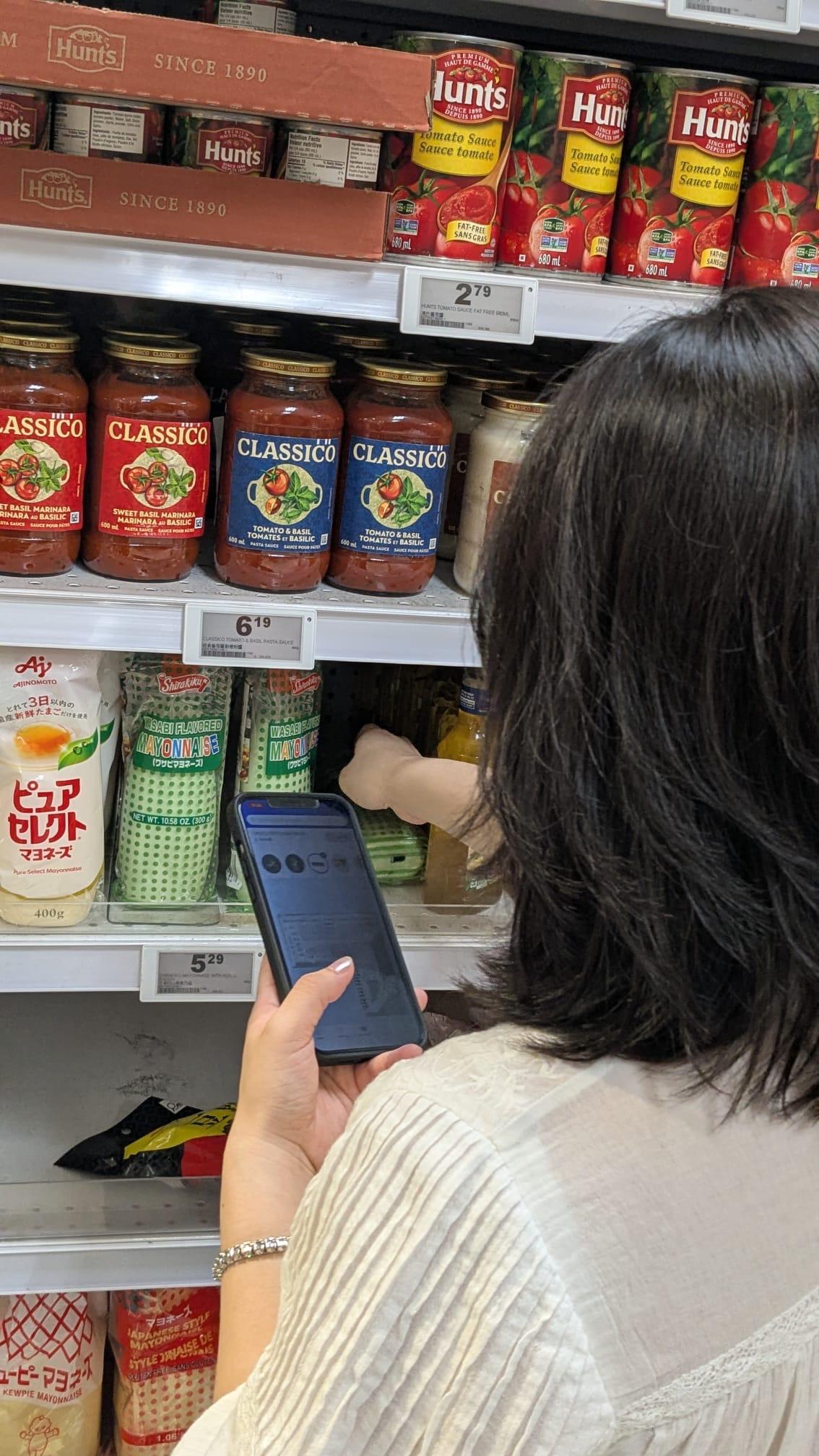
Participant feedback
The fixed header made the next step easier to read.
Participants said the item list and map were easier to take in together when the selected product stayed visible at the top of the screen.
Interaction gap
The bottom sheet did not always signal that it could move.
Several shoppers did not notice the sheet was expandable or collapsible. The map gained space only when an interaction people missed was discovered.
Decision
Keep the item and map visible by default.
The fixed header became the final direction because it kept the current product in view without requiring shoppers to discover another control.
Prototype constraint: Live positioning was not available during the test. When shoppers asked where they were, a store employee provided location confirmation. This let me evaluate the clarity of product and map information, but not autonomous self-positioning.
What if Walmart helped shoppers find products in-store?
Grocery Nav imagines how Walmart's familiar shopping experience could extend from search and cart into the physical aisle. I used public Brand OS guidance as a reference while designing the components needed for item finding and in-store navigation.
Referenced Walmart Brand OS ↗Design to code
How the design system connected to code
Existing language
Public Walmart brand guidance and established app patterns created the recognizable base.
Semantic meaning
Tokens described purpose, such as selected, found, route, and surface. They did not describe a specific hex value.
Component states
The same state rules applied to item icons, map pins, controls, and feedback.
Developer alignment
Figma variables and React tokens followed shared names so design and implementation could be checked against the same rule.
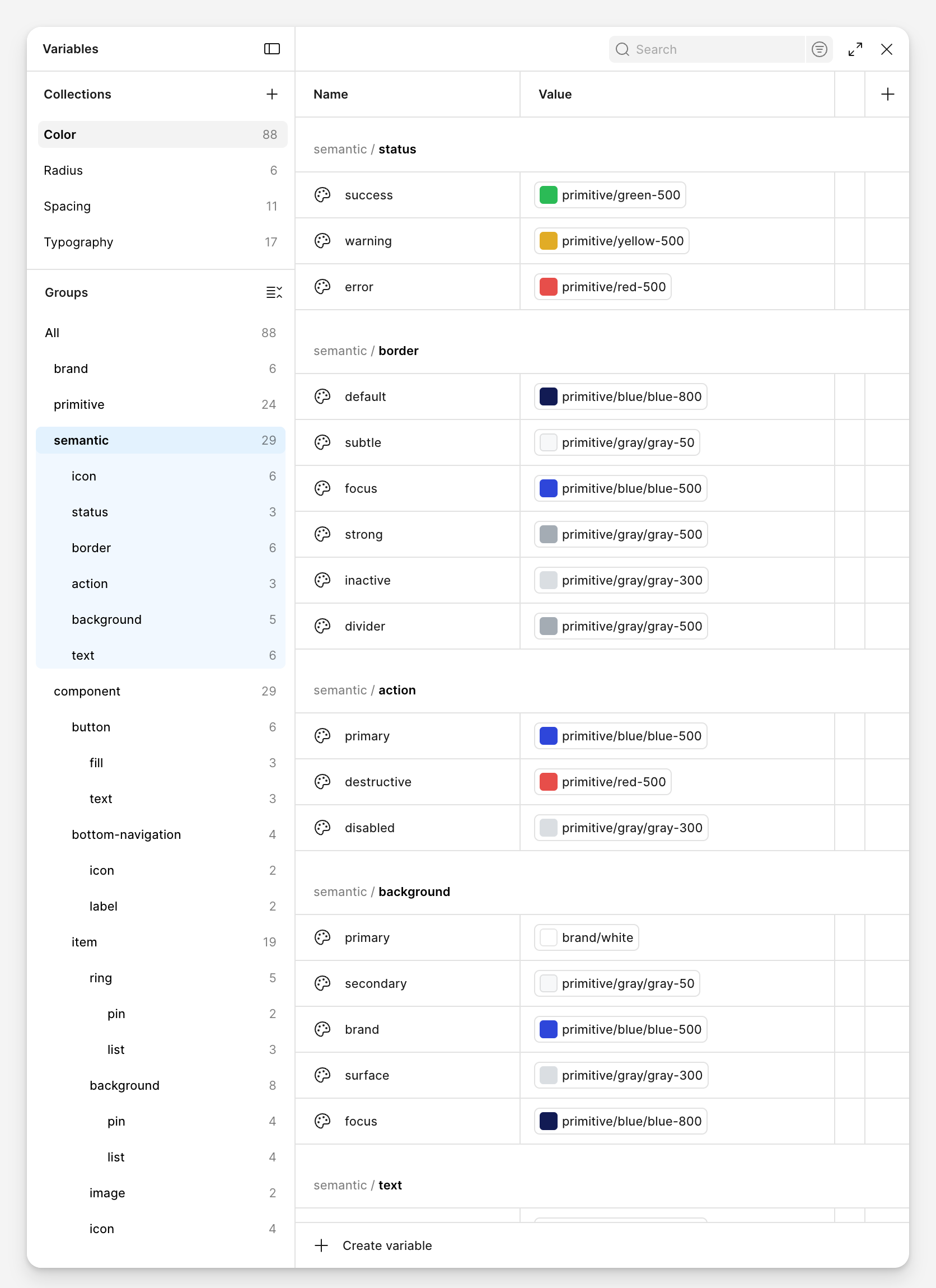
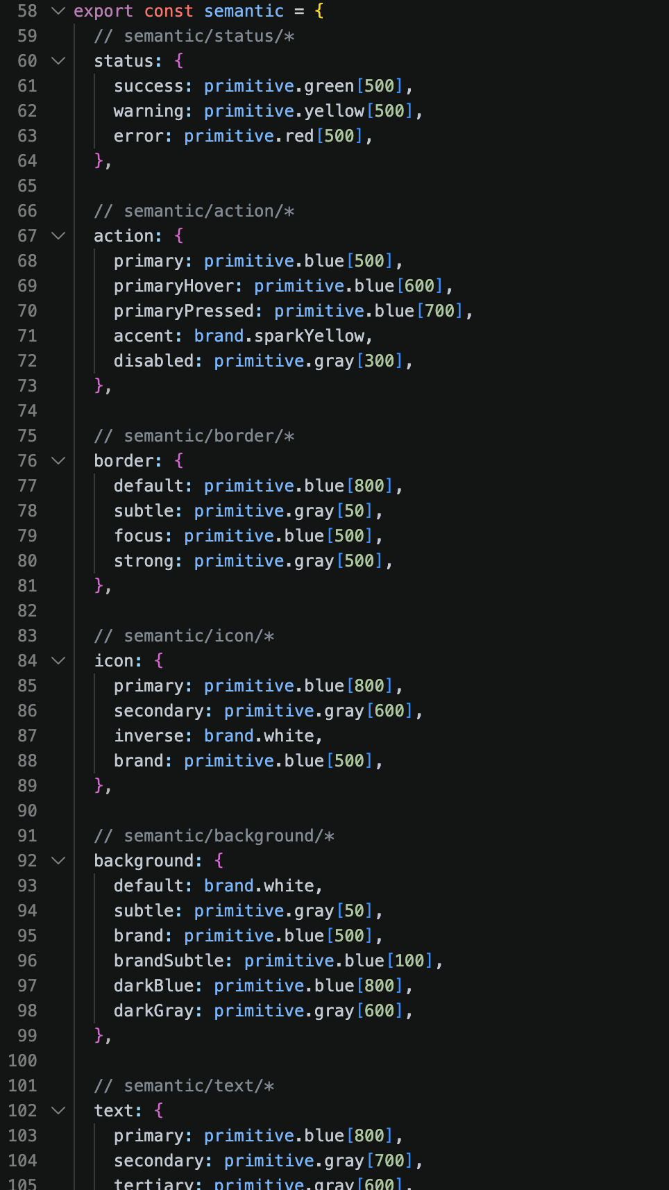
The small details had to work at scale.
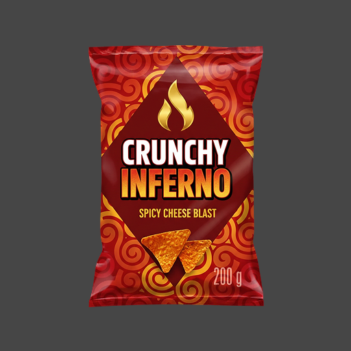
To populate the prototype, the developer registered real products in the database. I built an automated image-processing system to prepare every product image to the same visual standard, so the interface remained consistent as the catalog grew.
Different source photos. One consistent product asset.
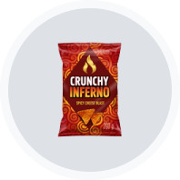
The prototype needed more than 100 product images with different backgrounds, padding, and proportions. I created a Python tool that removes backgrounds and prepares each product for a repeatable in-app treatment.
Each output uses a transparent 60 × 60 PNG canvas. The product keeps its original proportions, fills 70% of the circle, and stays centered so every item reads consistently in the interface.

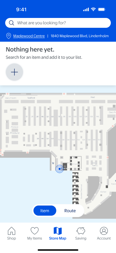
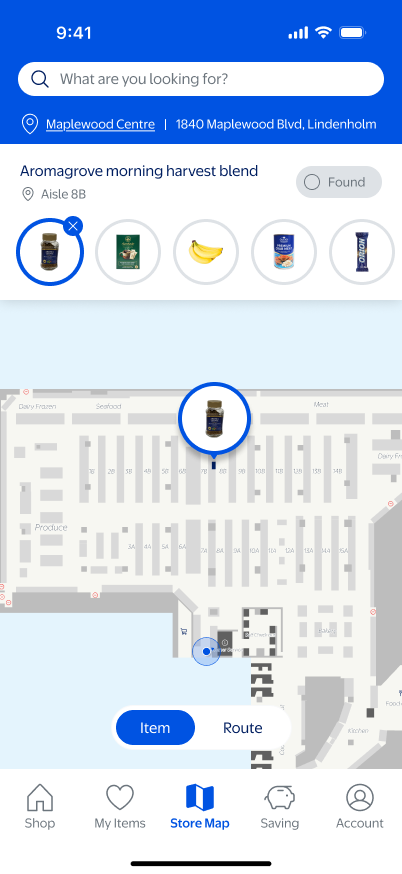
From an empty list to a completed trip.
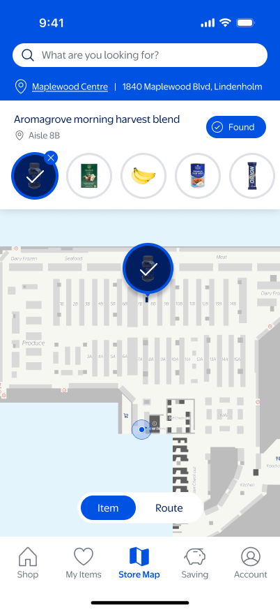
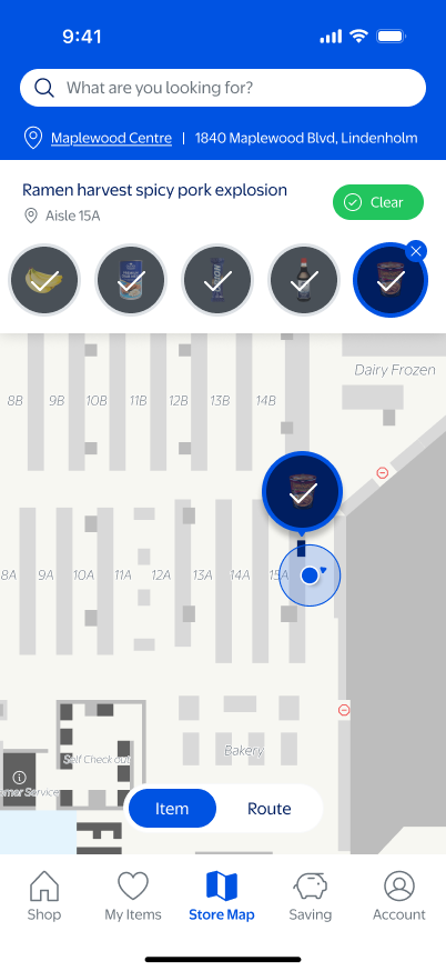
The final Android prototype connects search, product selection, aisle location, and completion in one persistent map experience.
Reflection
What the prototype surfaced
Store mapping
Product locations were difficult to verify from the floor plan alone. Store staff confirmed locations during testing, which made the map useful for evaluation but not independently maintained.
Indoor positioning
The prototype could not reliably show a shopper's precise current position. A production version would need indoor positioning infrastructure and live store data.
What I would carry into the next test
Control one variable at a time.
In the first round, product states and interaction details differed alongside the layout. Rebuilding the comparison showed that small differences can change what participants report.
Make movement discoverable.
The bottom sheet could collapse, but some shoppers did not notice that it moved. An interaction should communicate its behavior before it is used.
Extend item finding into route planning.
The next iteration would add Route mode to sequence the remaining items into a clearer path and reduce backtracking across the store.
See More Projects