I'm here — Vancouver, BC
ALTRA is a hiking safety navigation concept designed for beginner hikers.
Instead of focusing on route precision, the system prioritizes real-time risk awareness through a state-first interface. By translating environmental conditions into clear safety states such as Safe, Caution, and Critical, the redesign gave hikers a more readable decision layer.
The interface moves from location accuracy to decision confidence.
Recognition
0%
faster
Awareness
0%
accuracy
On the trail, you do not always know which direction is correct. But you still have to choose one.

Finding
The problem is not knowing where you are. It is knowing what to do next.
Even if location were exact, hikers would still encounter moments where the right choice is unclear.
Apps provide
Hikers face
GPS location
Ambiguous junctions
Route lines
Scale distortion
ETA estimates
Fading daylight
The goal was supporting decisions under uncertainty rather than improving navigation accuracy.
Method
Google Form questionnaire + online community review + informal peer feedback
Participants
12 beginner hikers, 3 peer hikers (ages 25–40)
Format
Multiple-choice and short answers, with casual peer conversations
Analysis
Grouped recurring themes through manual clustering and pattern recognition
Hiker A
“I thought I was on the right path until it was too late.”
Hiker B
“I kept checking the map, but I still wasn't sure.”
Hiker C
“I didn't know if turning back was overreacting.”
Reframing
Hikers don't need more accurate navigation. They need a clear standard to judge whether continuing is still safe.
From route to state.
Route to State
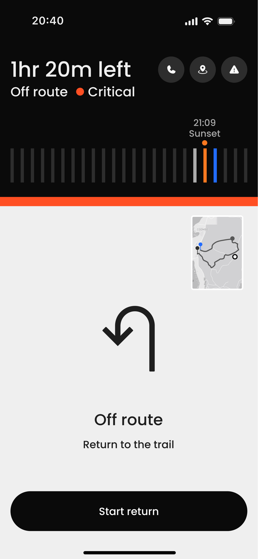
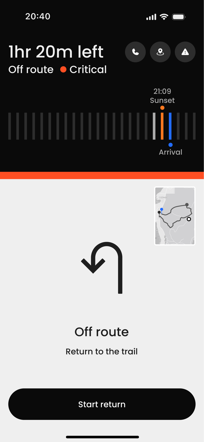
Instead of focusing on the path, the interface centers on the current safety state.
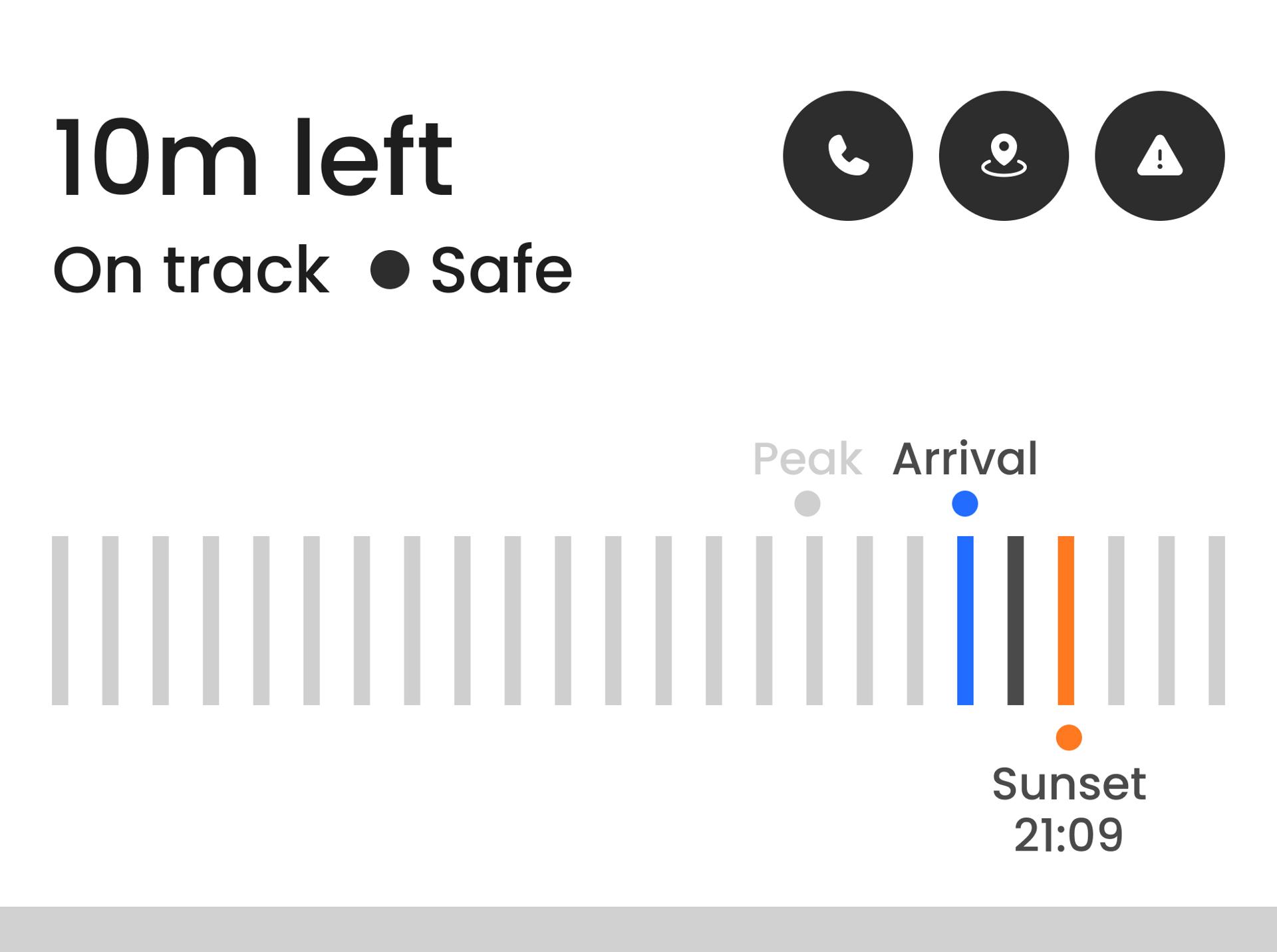
Safe
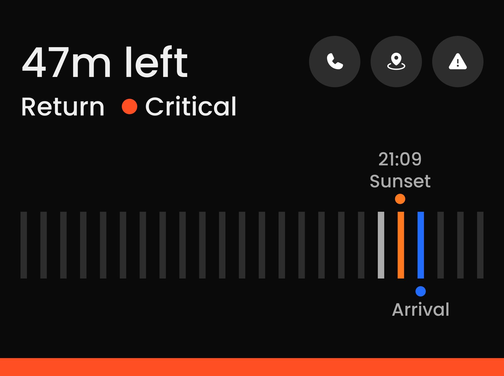
Critical
Metrics to Signals
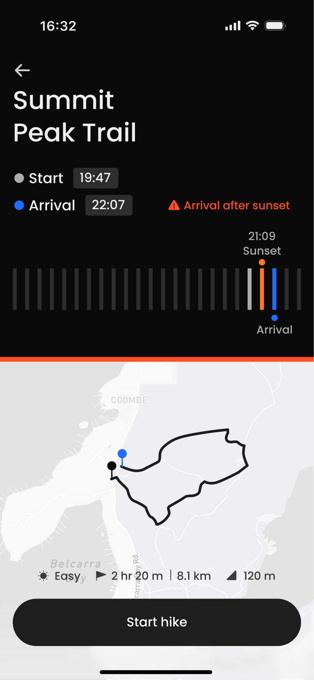
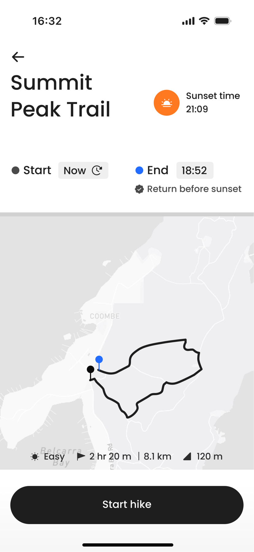
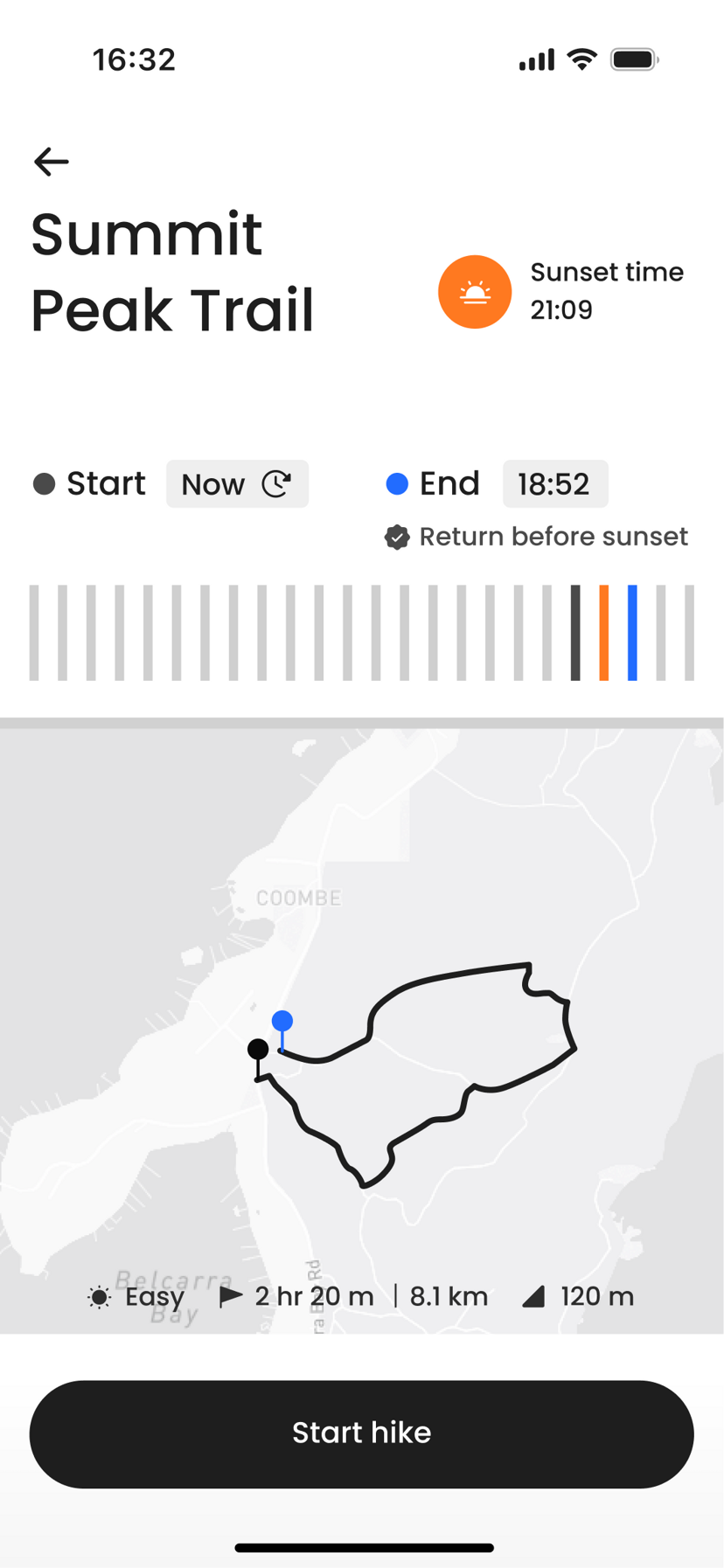
ETA, daylight, and route progress collapse into a single judgment line.
Safety State Model
Each state has defined temporal and environmental thresholds.
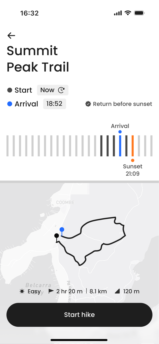
Safe
Critical
Three tests. One question — does the safety state register first?
Pilot study · 4 participants · Figma prototype · A/B comparison
Each test isolated one decision: how users read the state, the time pressure, and the next action. Findings fed directly back into the layout.
Label clarity
What we tested
Whether explicit state labels would improve recognition over visual warning structure alone.
What we found
Naming the state (Safe, Caution, Critical) let users identify it almost immediately. Without it, users scanned and second-guessed.
Before
After
Recognition time
4.88s to 2.06s 58% faster
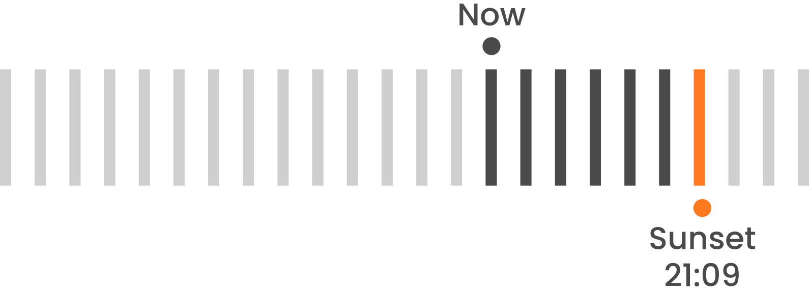
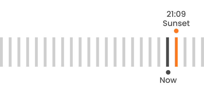
Timeline orientation
What we tested
Whether users could read time pressure more intuitively when markers were aligned in one direction.
What we found
A single-direction timeline let users compare now, arrival, and sunset in one glance instead of mentally re-orienting.
Before
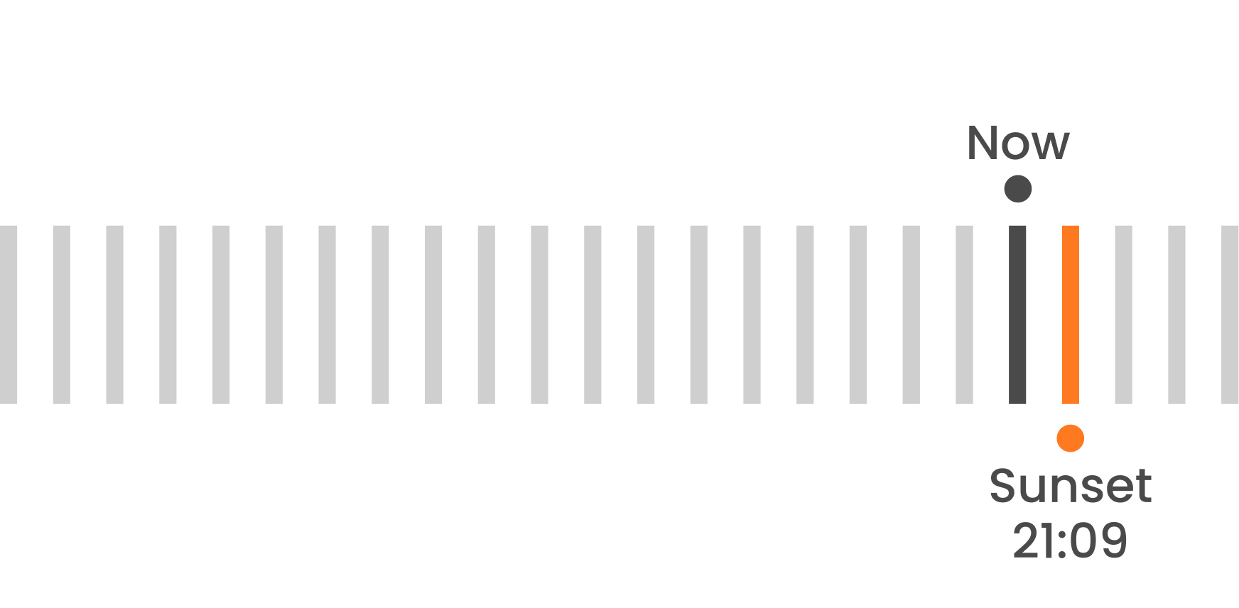
After
Risk awareness
25% to 75% 3x accuracy
Critical action
What we tested
Whether critical-state guidance helped users understand what action to take next.
What we found
When the critical state surfaced a clear next step, users acted decisively instead of hesitating between options.
Before
After
Confidence rating
4.0 to 4.75 +0.75 pts
Test 01 · Recognition
0%
faster with explicit labels
4.88s to 2.06s
Test 02 · Confidence
+0.00
confidence with spatial timeline
4.0 to 4.75
Test 03 · Awareness
0%
recognized both risks
warning is not relationship
Explicit labels cut recognition time by more than half. A spatial timeline lifted confidence where numbers alone could not. And under critical risk, only a quarter of users registered both threats. The warning landed, but the time relationship stayed unread.
Users didn't need more data. They needed the interface to translate data into a clear safety state.
How the system behaves
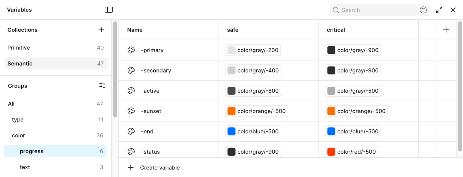
Each safety state has its own visual language.
What I learned from this project
Confidence matters more than speed
In high-risk environments, speed alone is not enough. Hikers often make decisions alone, and uncertainty can increase hesitation. This project taught me that users need reassurance as much as quick information. Designing for safety means helping users feel confident before they act.
Safety requires defined thresholds
Safety design requires clear thresholds. Time buffers, weather limits, and trail status must be defined before the interface is built. Logic comes before visuals.
Clear state logic improves recognition
I initially introduced three safety states. But the intermediate Warning state blurred decision boundaries. Reducing the system to clear, binary states improved recognition accuracy and reduced hesitation.
See More Projects


