I'm here — Vancouver, BC
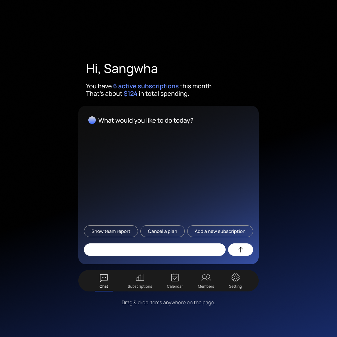
Managing subscriptions became a conversation.
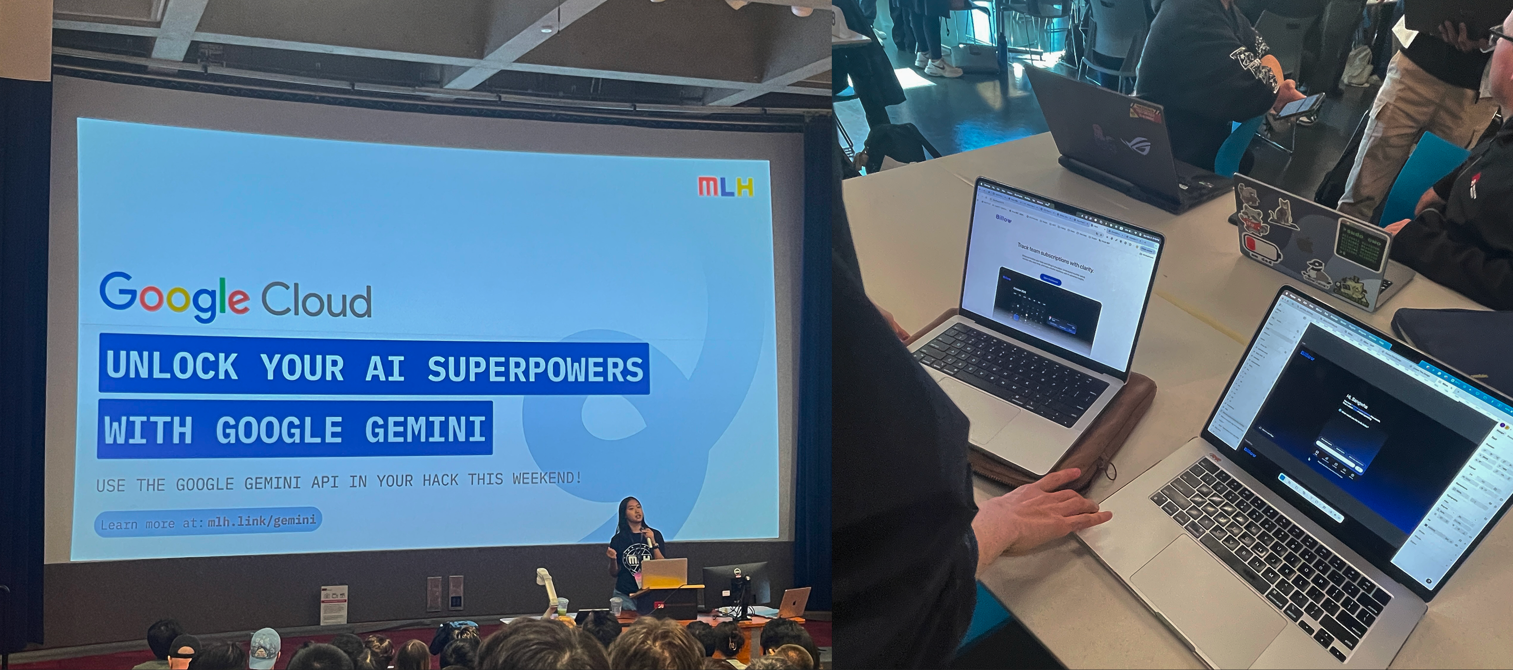
Billow began as a 24-hour hackathon MVP built with Gemini AI and no backend. The prototype validated conversational workflows quickly, then evolved into a scalable operational system.
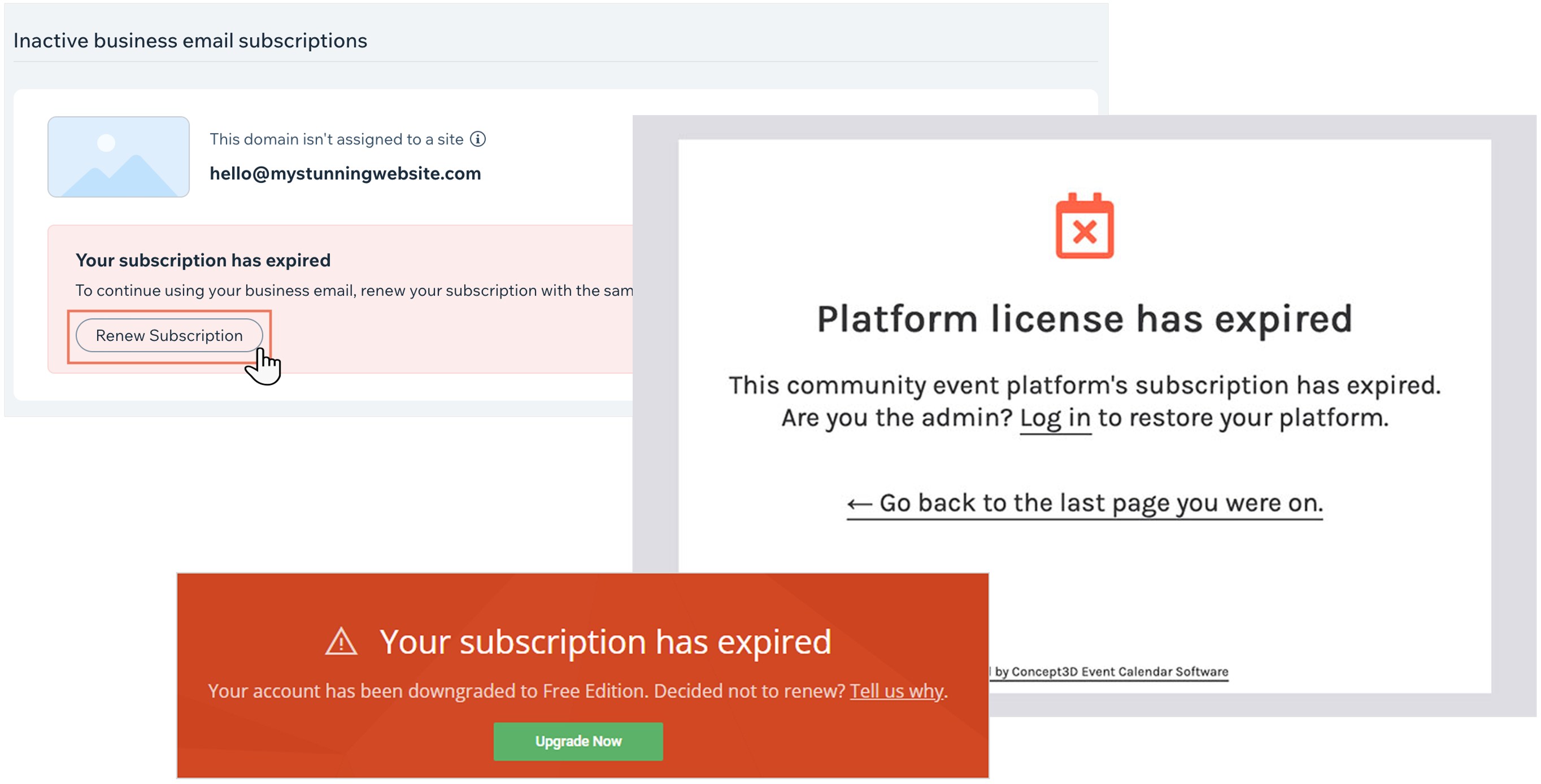
Teams worked across multiple SaaS tools. Managers had to ask people to understand usage.
Unused seats stayed active. Renewals slipped. Admin work slowed everything down.
Information was distributed across tools. Managing it meant visiting each one separately.
Actions start in conversation. Confirmation happens in the dashboard.
Teams could manage subscriptions without learning each tool. The concept expanded into a scalable system.
Responsibility disappeared between tools, teams, and handovers.
I surveyed 12 people across roles (designers, HR managers, and individual users) to understand how subscription responsibility actually moves through a team. Each person only knew the subscriptions relevant to them. No one had the full picture, and no one was accountable for the gaps.
In small teams, software subscriptions are often managed informally. Responsibilities shift as people join or leave.
Finding
The issue wasn't memory. It was the reliance on memory instead of shared visibility.
"Requesting access and cancelling goes through too many steps, so I just left it."
Designer
"I took over the account and didn't know whether it was still in use."
New manager / HR
"I forgot to cancel before the renewal."
Individual user
Change how teams take action, not just how they view data.
During the hackathon, we turned the concept into a working MVP to test whether conversation-based action could function as a real interface.
The concept worked. But it needed a system to scale.
After the MVP proved the interaction model, I defined reusable UI rules so new workflows could be built from the same structure instead of redesigned from scratch.
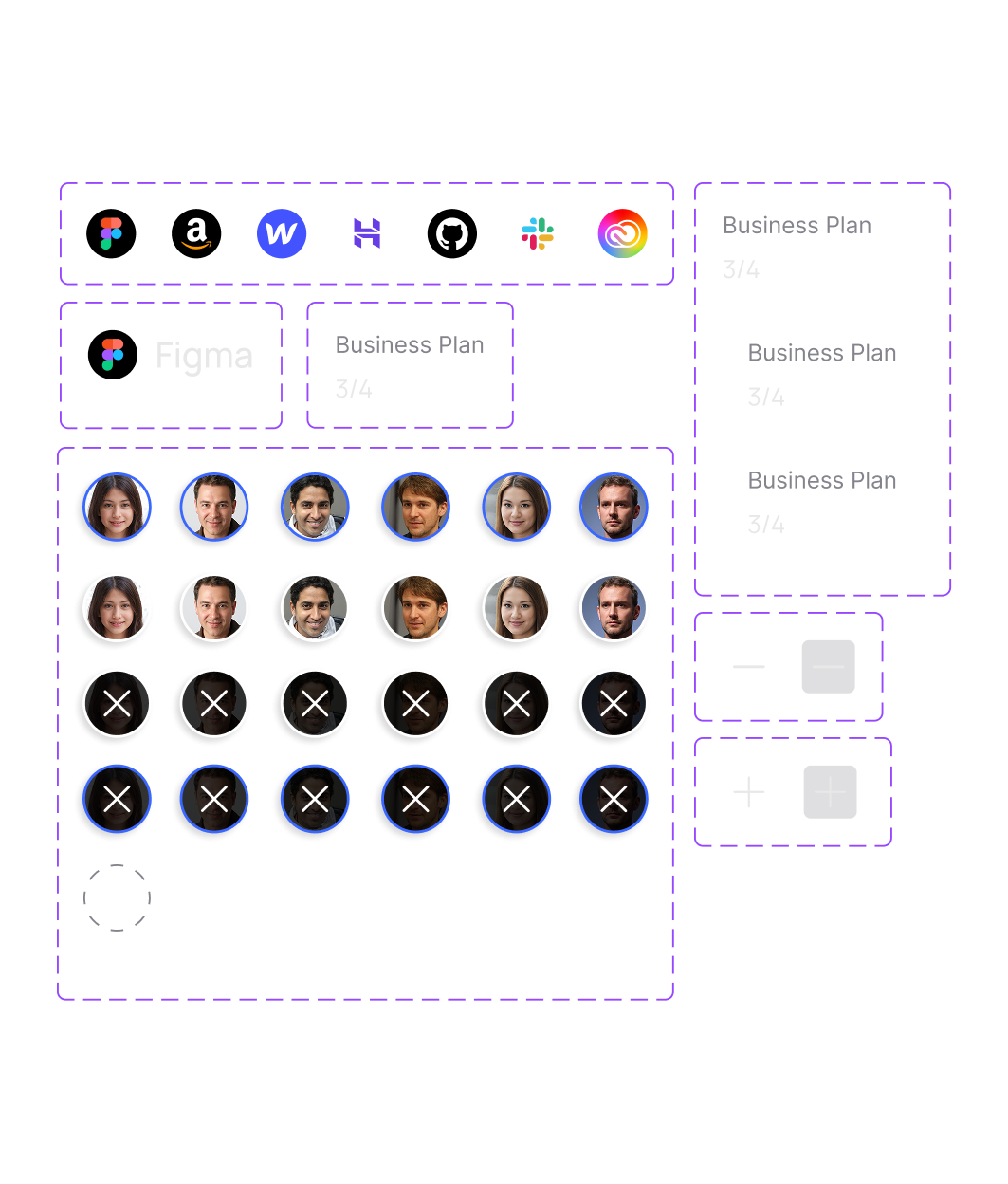
Build from parts
Interfaces are built from primitives, not new components.
Meaning over placement
Layout follows semantic roles, not manual arrangement.
Recomposition over redesign
New screens emerge by reorganizing the same semantic blocks.
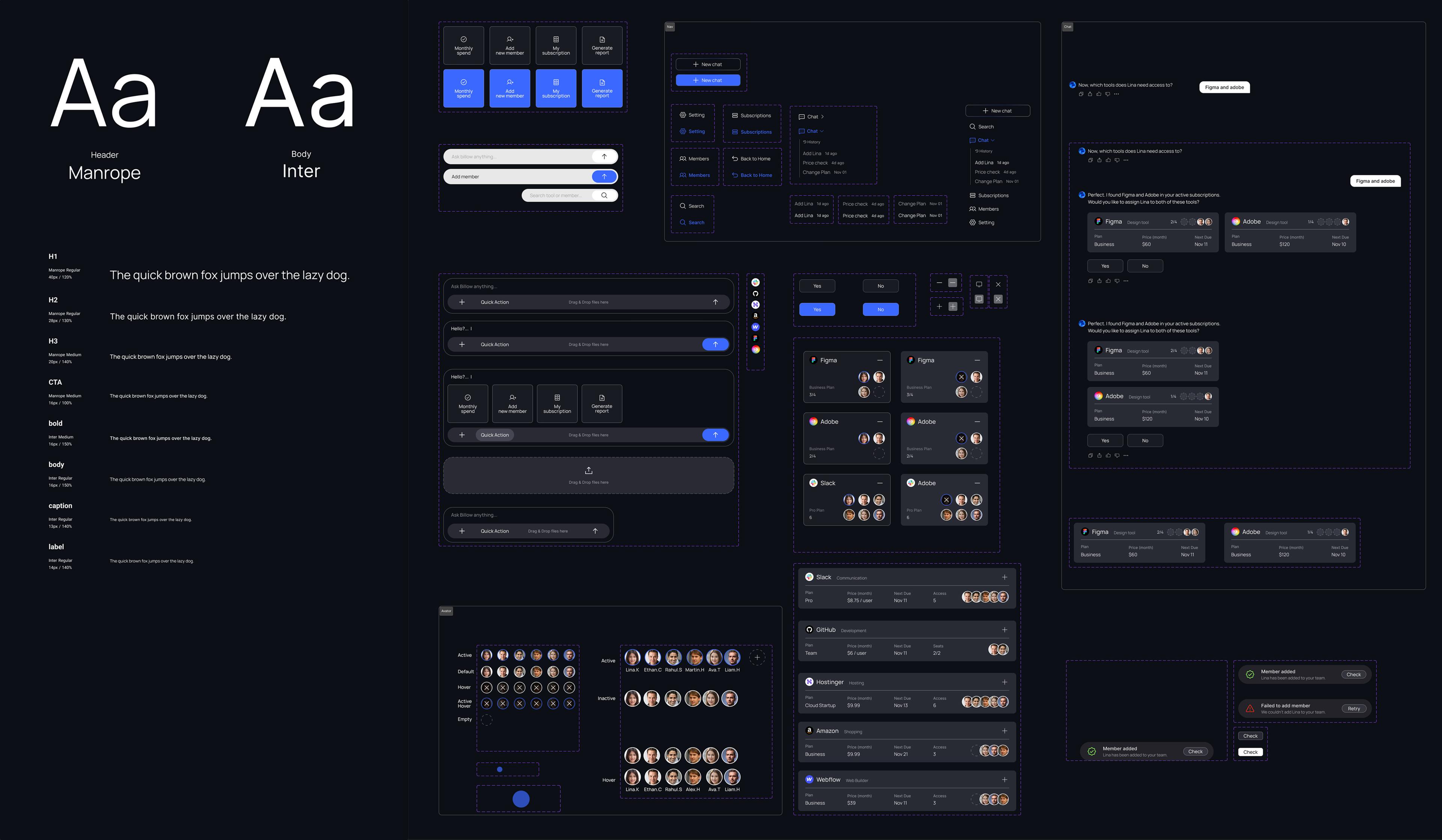
A scalable interface set built from the same rules.
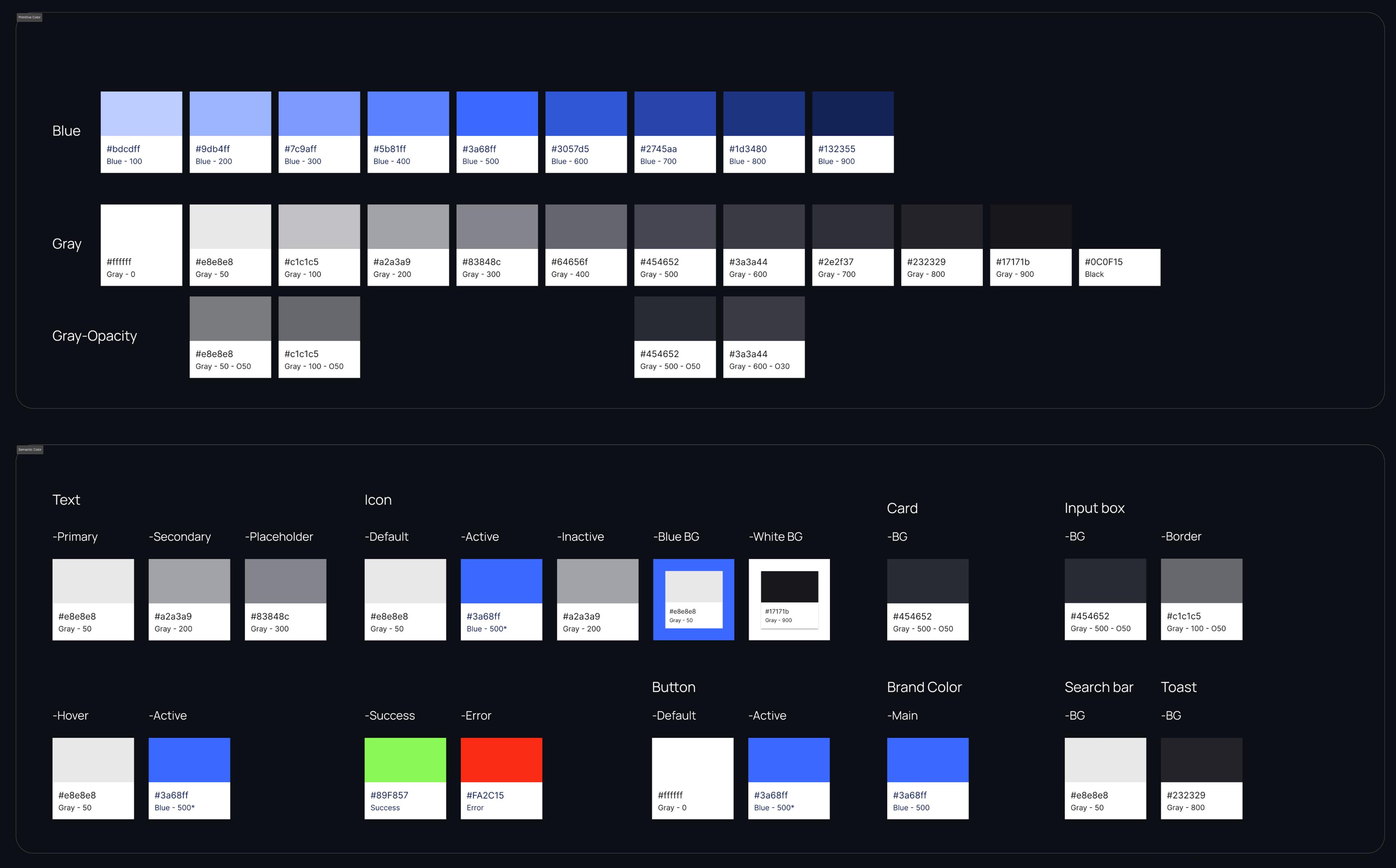
Primitive values, semantic tokens, and layout patterns were unified into a consistent design system, making the product easier to scale and maintain over time.
AI-guided onboarding, end-to-end.
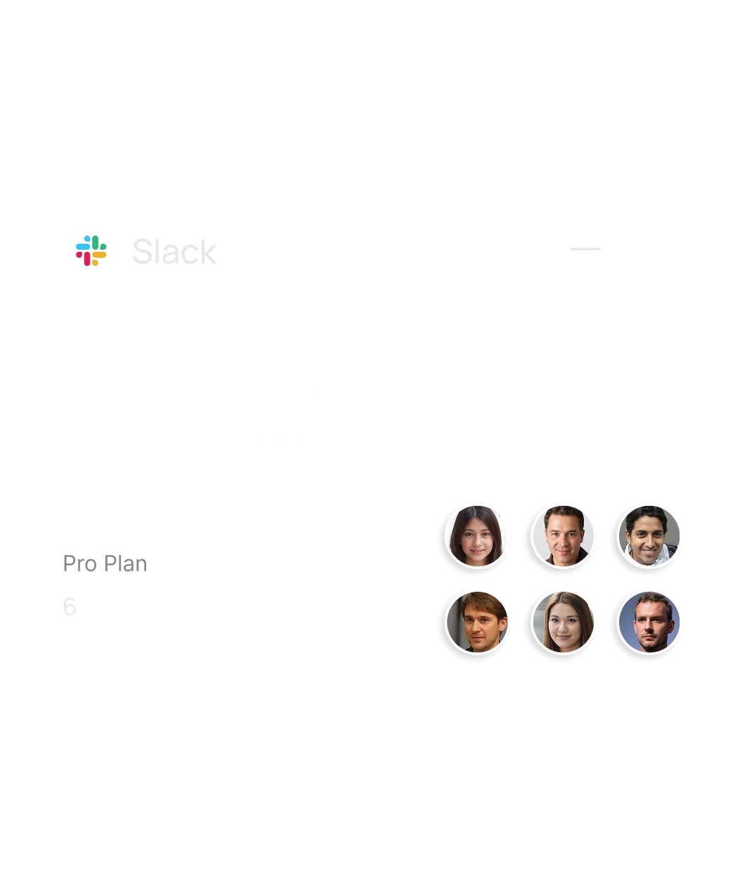
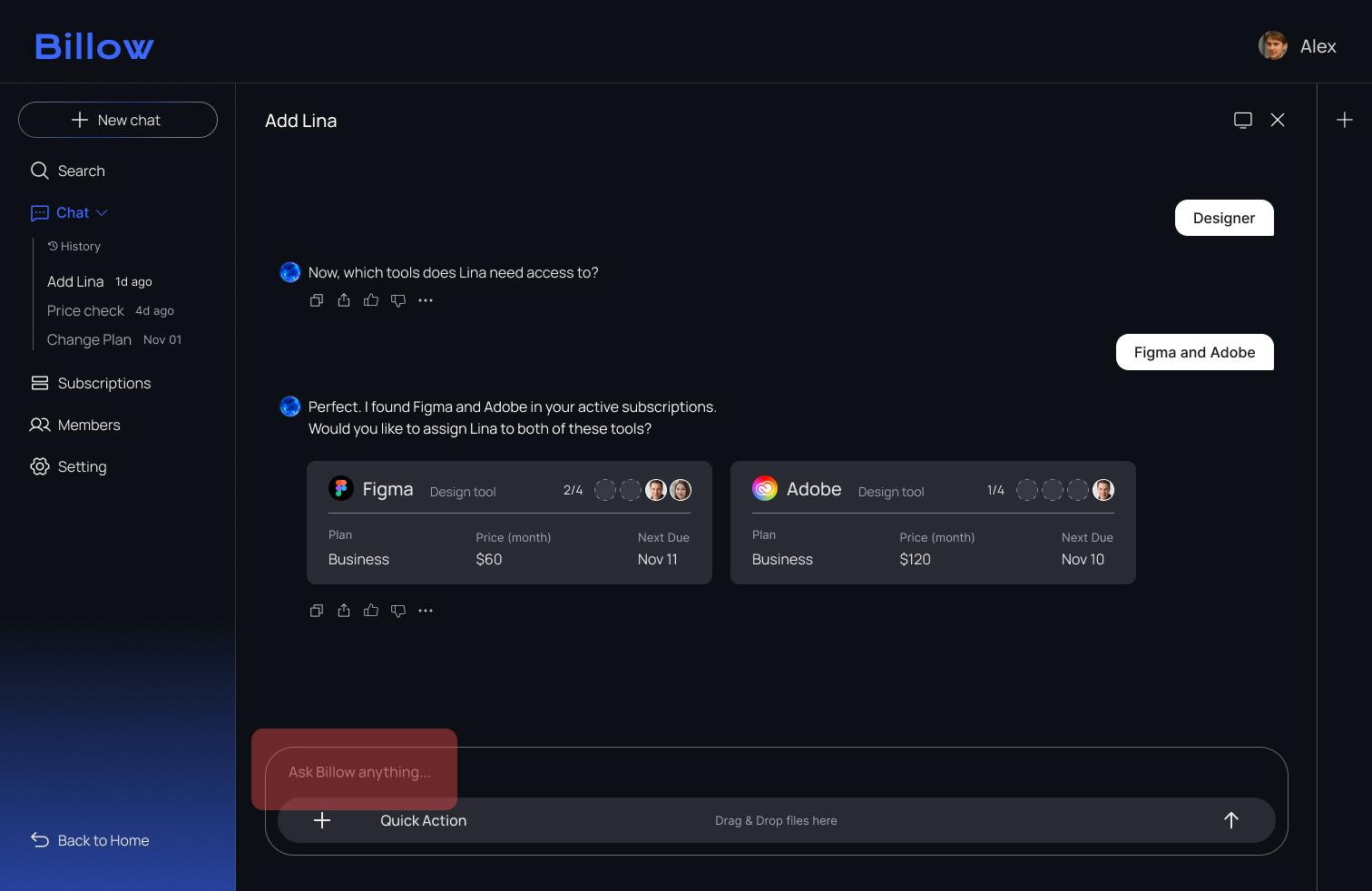
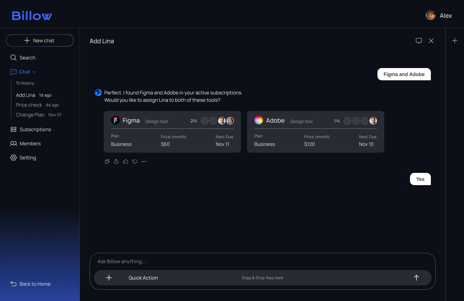
An end-to-end onboarding flow was built using the new system. Alex (an HR manager) opens Billow to register Lina (a new designer). She needs Figma, Adobe, and Slack. Billow scans active subscriptions, suggests available seats, and as Alex confirms tools through chat, the canvas updates in real time.

Alex
HR manager
Opens Billow and registers Lina through the chat. With AI guiding the flow, he assigns the tools she needs in just a few clicks.

Lina
New designer
is joining the team and needs access to design tools like Figma, Adobe, and Slack.
Main page
Add member in seconds
Alex starts Lina’s onboarding directly from Quick Action.
Chat
Enter Lina’s info through chat
Name, role, and required tools are filled out conversationally.
Assign seat
AI finds the right seats
Billow scans active subscriptions, identifies the required tools, and suggests available seats for Lina.
Canvas view
Progress shown at a glance
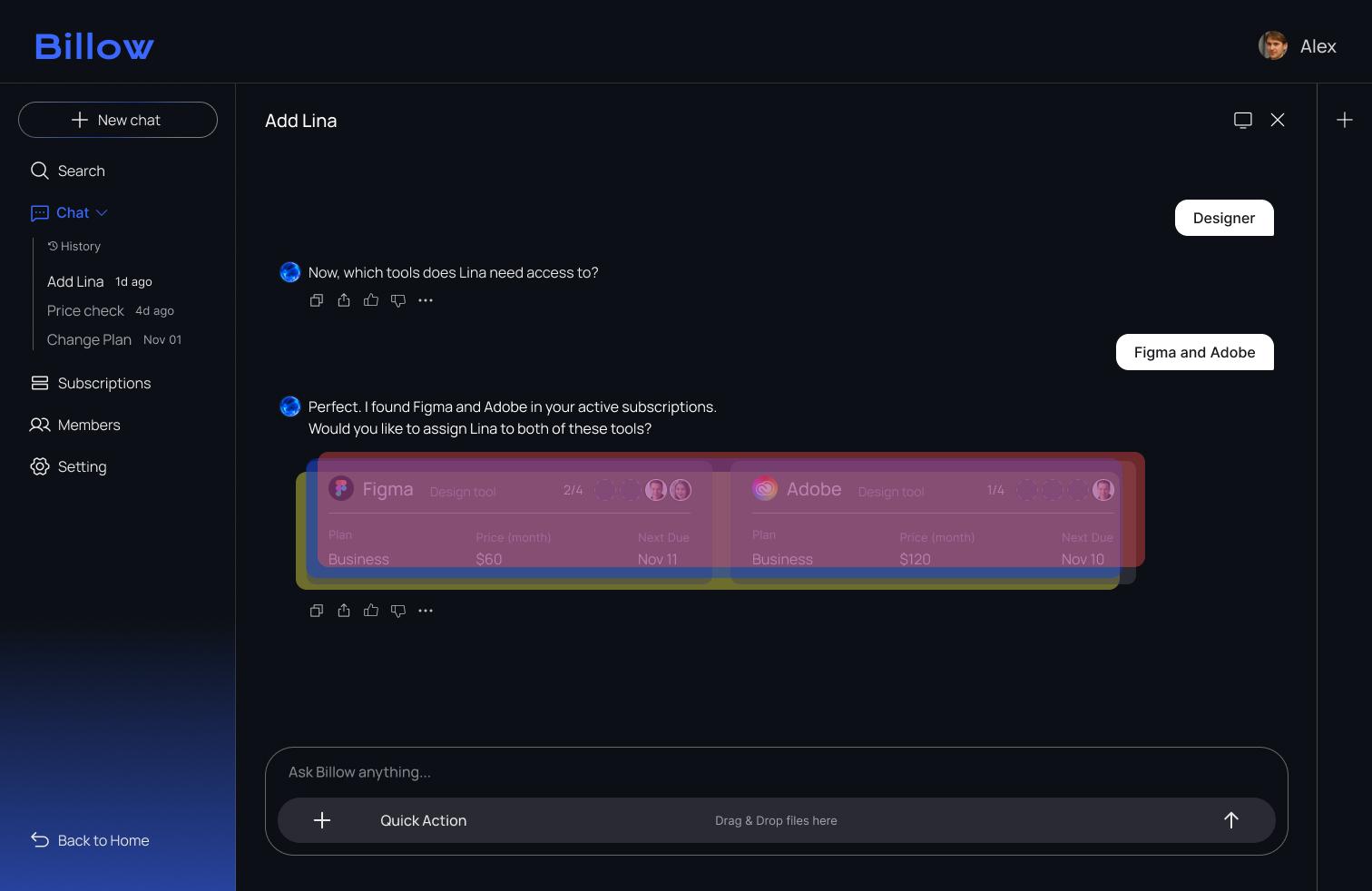
The canvas updates in real time, visually reflecting each tool Alex confirms through chat.
Members page
Review and add tools instantly
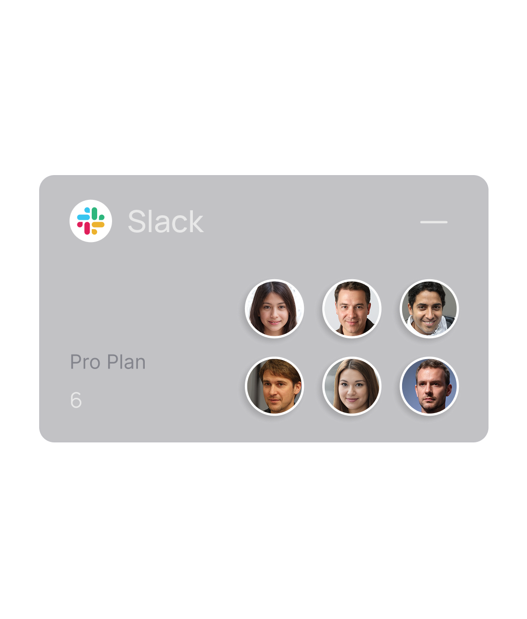
Alex reviews Lina’s assigned tools and adds Slack with a single click.
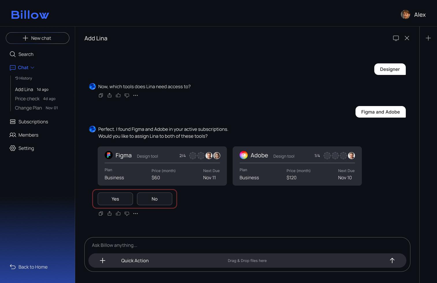
Users clicked when we expected them to type.
Users assumed the tool cards were interactive and clicked them instead of approving via chat. As a result, the onboarding flow stopped because the system was waiting for a chat response.
Yes / No Buttons Added
Before
After
Confirmation Toast Added
Before
After
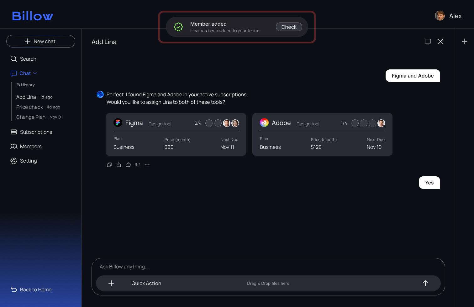
To guide users more clearly, I added explicit Yes/No buttons and a confirmation toast. These changes removed confusion and helped users complete the approval step with confidence.
Result
What I learned from this project
People preferred choosing over typing when certainty mattered.
Users did not want to explain everything in chat. When outcomes had to be clear, selecting an option felt more trustworthy than writing a message.
The goal was not to simplify the UI. It was to change how decisions happen.
Users hesitated before taking action, so the interaction pattern was changed to give them confidence earlier. Not to remove pixels.
The system needed shared understanding from the beginning.
Design handoff was difficult because alignment takes effort, not UI complexity. Developers were engaged early to define how actions, states, and responsibilities work across the system.
See More Projects


