I'm here — Vancouver, BC

Overview
ALTRA is a hiking safety navigation concept designed for beginner hikers.
Instead of focusing on route precision, the system prioritizes real-time risk awareness through a state-first interface.
By translating environmental conditions into clear safety states such as Safe, Caution, and Critical, the redesign gave hikers a more readable decision layer.
The interface moves from location accuracy to decision confidence.
Recognition
0%
faster
Awareness
0%
accuracy
Context
Vancouver's trails are crowded.
Search and rescue calls keep rising.
The North Shore sits twenty minutes from downtown. Grouse, Seymour, and the Chief draw thousands of casual hikers every weekend, many of them new to the trails.
The pattern is rarely “lost in the wilderness.”
It is hikers continuing forward after something already felt wrong. That gap between having information and acting on it became the starting point of this project.
App audit
AllTrails · Gaia · Google Maps · Strava
What they solve
Where am I, where is the trail, and how do I keep following the route.
What remains unresolved
Whether the current situation still supports continuing forward.
Should I keep going?
We audited the apps hikers actually use on the North Shore. AllTrails, Gaia, Google Maps, Strava. They all solve the same problem well. Where am I, and where is the trail.
None of them answer the question hikers keep asking themselves on the way up.
The Problem
Knowing where you are isn't the same as knowing what to do next.
Most hiking interfaces assume information automatically creates confidence. In reality, hikers hesitate even when the map is technically accurate.
The issue wasn't a lack of information. It was the absence of interpretation.
Map gives
Position, route, elevation, ETA, and a dense set of environmental details.
Hiker needs
A readable signal that clarifies whether continuing still makes sense.
Even with exact GPS, the right next step isn't always obvious.
Research
15 hikers. One question. When do you stop trusting the map?
Exploratory survey · Google Forms · 12 beginner + 3 peer hikers · ages 25-40 · Vancouver
This was lightweight, directional research. The goal was to surface patterns of hesitation, not measure prevalence.
Participants described a gradual loss of confidence. They kept moving forward while feeling less and less sure.
“I thought I was on the right path until it was too late.”
“I kept checking the map, but I still wasn't sure.”
“I didn't know if turning back was overreacting.”
Hikers don't need more precision. They need a signal that their next step is safe.
Design Direction
From route to state.
Testing revealed users still hesitated when too many metrics competed for attention. The interface needed to communicate a decision, not just information.
Route to State
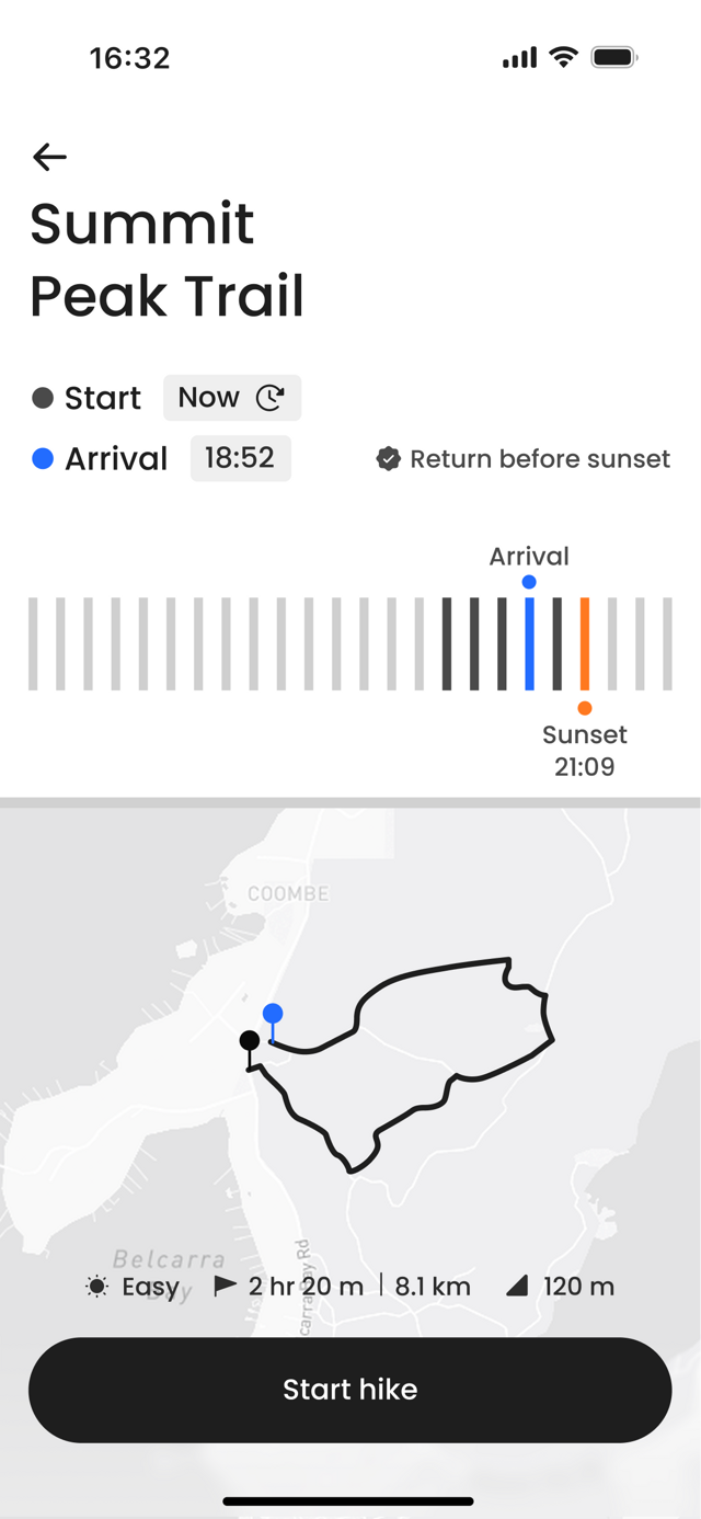
Instead of focusing on the path, the interface centers on the current safety state.
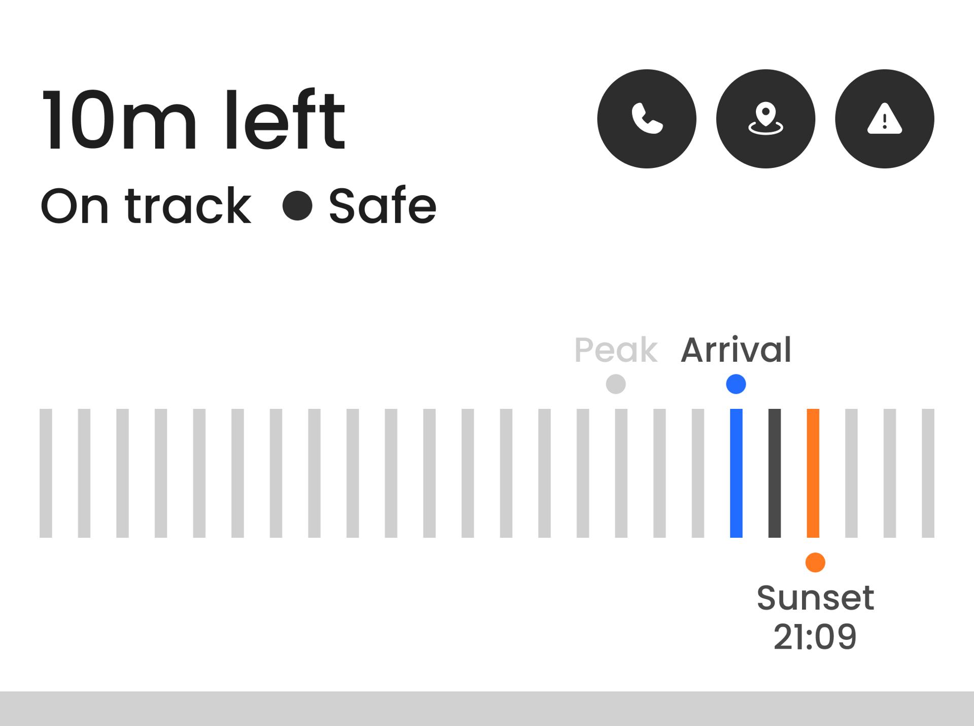
Safe
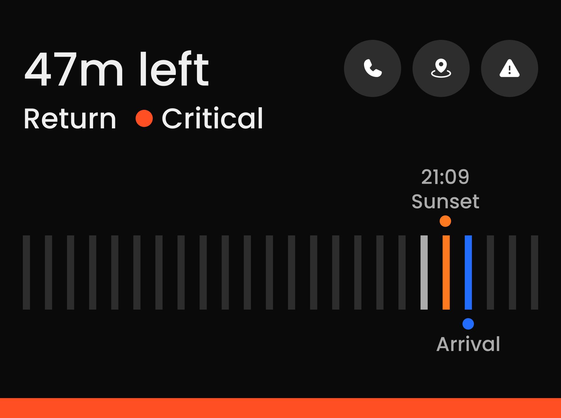
Critical
Metrics to Signals
ETA, daylight, and route progress collapse into a single judgment line.
Safety State Model
Each state has defined temporal and environmental thresholds.
Safe
Critical
State to Tokens
Color, weight, and hierarchy shift with risk. Not brand.
Testing & Results
Three tests. One question — does the safety state register first?
Pilot study · 4 participants · Figma prototype · A/B comparison
Each test isolated one decision: how users read the state, the time pressure, and the next action. Findings fed directly back into the layout.
Label clarity
What we tested
Whether explicit state labels would improve recognition over visual warning structure alone.
What we found
A named state — Safe, Caution, Critical — was identified almost immediately. Without it, users scanned and second-guessed.
Before
After
Recognition time
4.88s → 2.06s 58% faster
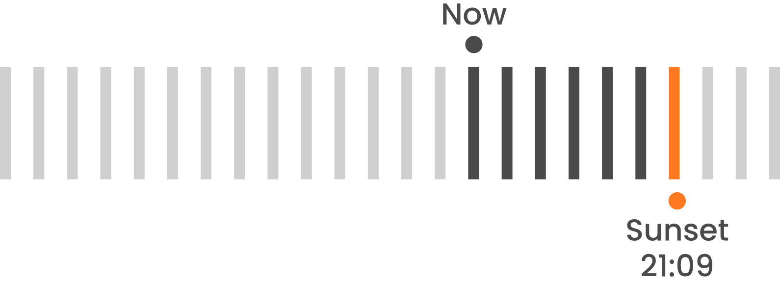
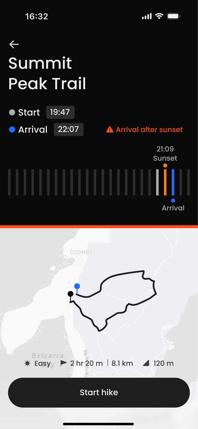
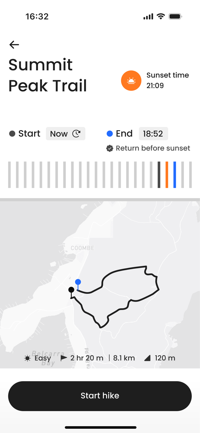
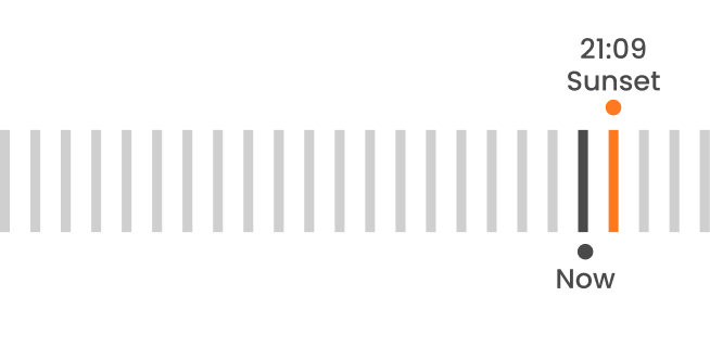
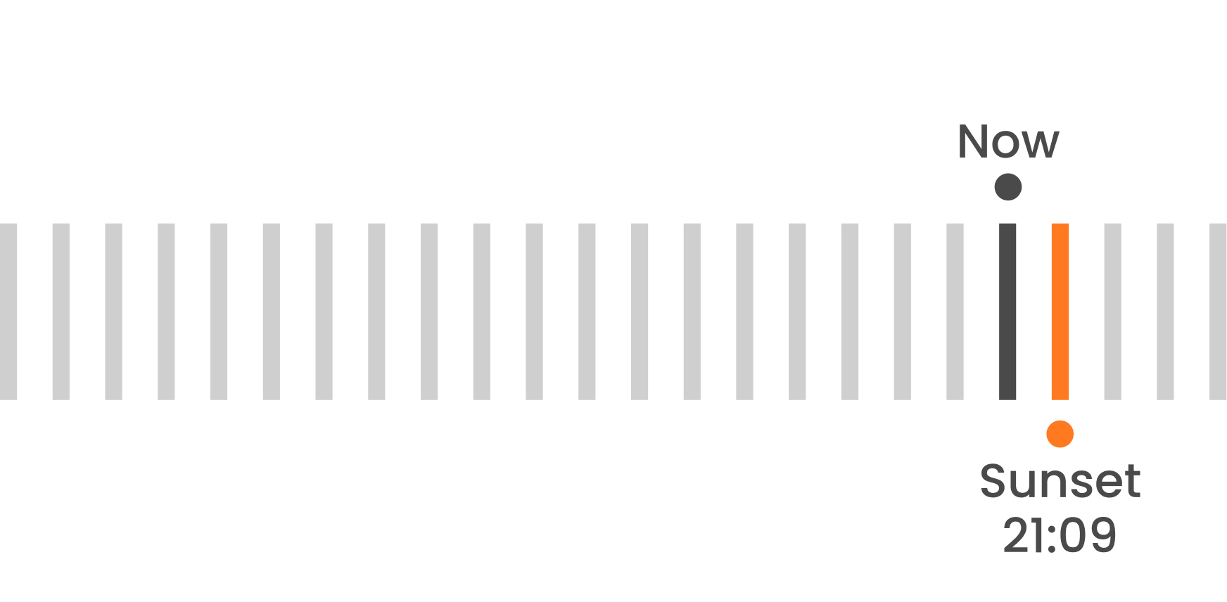
Timeline orientation
What we tested
Whether users could read time pressure more intuitively when markers were aligned in one direction.
What we found
A single-direction timeline let users compare now, arrival, and sunset in one glance instead of mentally re-orienting.
Before
After
Risk awareness
25% → 75% 3× accuracy
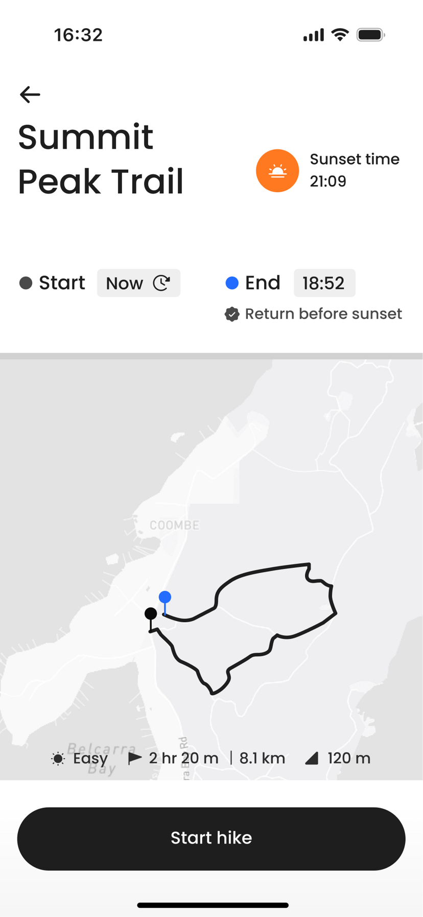
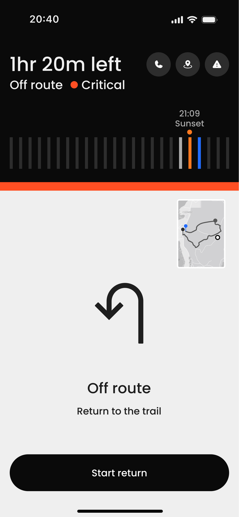
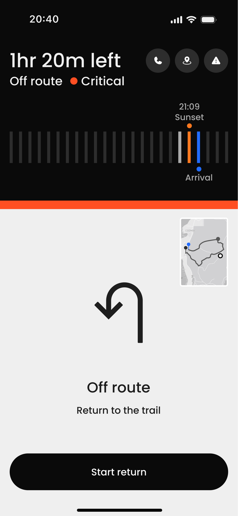
Critical action
What we tested
Whether critical-state guidance helped users understand what action to take next.
What we found
When the critical state surfaced a clear next step, users acted decisively instead of hesitating between options.
Before
After
Confidence rating
4.0 → 4.75 +0.75 pts
Test 01 · Recognition
0%
faster with explicit labels
4.88s → 2.06s
Test 02 · Confidence
+0.00
confidence with spatial timeline
4.0 → 4.75
Test 03 · Awareness
0%
recognized both risks
warning ≠ relationship
Explicit labels cut recognition time by more than half. A spatial timeline lifted confidence where numbers alone could not. And under critical risk, only a quarter of users registered both threats. The warning landed, but the time relationship stayed unread.
Users didn't need more data. They needed the interface to translate data into a clear safety state.
How the system behaves
Reflection
Designing for safety means designing for certainty.
I assumed better information would build user confidence. Research showed the opposite. Under stress, more data made users less sure.
The clearest lesson was that binary states outperformed vague ones. Ambiguity transferred from the environment to the interface itself.
ALTRA wasn't built to replace maps. It was built to reduce uncertainty.
Generic alerts like “Be careful” didn't change behavior. Explicit thresholds did.
See More Projects


